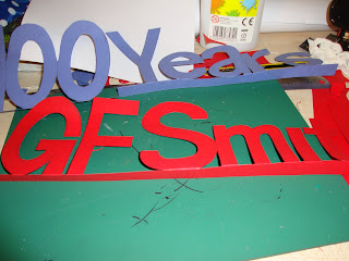
I decided to use the colours blue and red as on most of their posters GF Smith like to remind us that they are British.
These are just a few quick photos to investigate some layouts. I feel like i need more than just the words in the same typeface, Its not really showing much about paper.
This isn't exactly showing you the amazing things you can do with paper but still its something different, i'm going to see what i can do to arrange them with the other type i have cut out.
These 2 things really don't work very well together, especially like this. more experiments needed.
This is one of my earlier models for my sculpture. I found it lying around my room and thought about adding it into my layouts just to add something different to the piece. I surrounded it with some of the pieces i had from my cut outs before.
After layering the text on the top i don't think it works very well.
This does make me think about using the small sections to create something though.


No comments:
Post a Comment