
Monday 14 March 2011
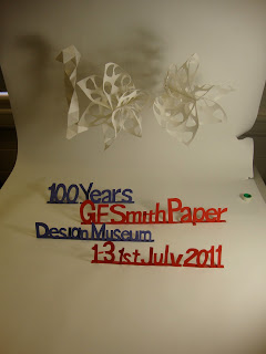
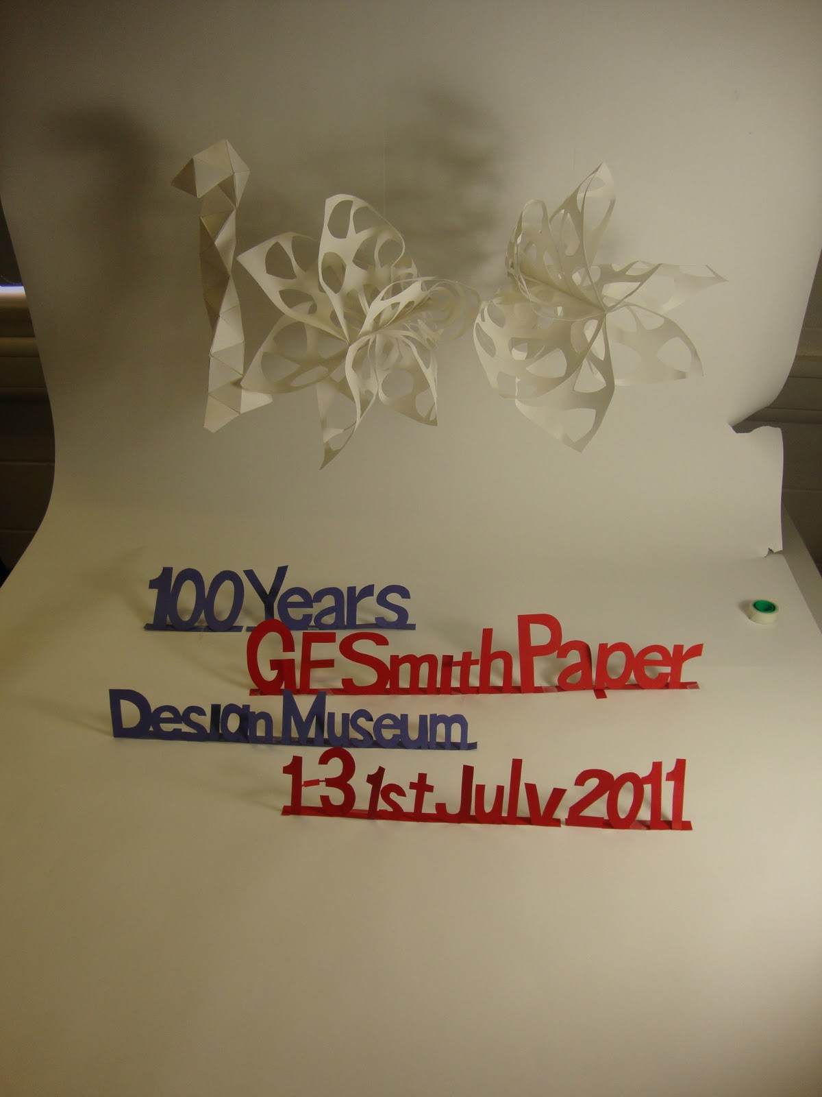
Final Poster Design

this is the original photo.

levels changed to make it brighter

curves changed to make it brighter again in different areas


This one was just a bit of experiment to see what different colours would look like. I prefer the red and blue, still in keeping with the british colour theme.

Seeing if i could create a background, just a faint one to add colour to the plain background. This obviously didn't work using the paint bucket. I think it definitely looks better with just the white background, highlighted with the lights and shadows.

This is the final image i will use for my poster i still feel like its missing something though so i found the Design Museum logo on google.


i then used the multiply tool to make the white parts become invisible, then the overlay selection to lighten the type so it flowed more with the piece.
The final thing i want to add onto my poster is the GF Smith logo, again i found this via google images and just downloaded it.

I then did the same as with the design museum logo and used the multiply tool to make the white sections invisble.

FINAL DESIGN COMPLETE!
In the words of Alan.. F**KKKKKK!
..Alan and Andy hate me, Along with anyone wishing to take photos after me.. Sorry!
As soon as i set up the studio to take some pics i manage to knock over one of the lamps and smash all of the bulbs. Not a very good excuse for rubbish photos but with only one lamp it was hard to get the correct lighting from both sides.


As soon as i set up the studio to take some pics i manage to knock over one of the lamps and smash all of the bulbs. Not a very good excuse for rubbish photos but with only one lamp it was hard to get the correct lighting from both sides.


The letters don't stand up as well as i had hoped however i love the shadows they create so i will keep them standing.


The more i look at the letters, the more i like the imperfections and the differences in the letters. I think it adds character to the piece (or so i hope).


So annoyed with myself for knocking that lamp over. all you can see in my set ups is the rip in the paper! Ugh stupid Amy.
However.. with a bit of touching up on photoshop and maybe playing around with the colours i think i may have my final poster design.
...
After testing out the other designs on photoshop i decided to try and combine my initial type ideas with the one of my 100 sculpture. Quick layouts in my room to see if it would work.


Not going to lie, i think this works quite well. The contrast between the bold letters and delicate-ish sculpture behind is strong but seems to work.
The Text is in typeface 'Helvetica Neue' which i think is what is used for GF Smiths other posters. As it is cut out and technically part of the sculpture the text seems to flow with the design like it belongs there.
Ill have to take this into the studio to take more professional looking photos.
Poster development

This is the photo i took in the studio of my sculpture for poster design, I was quite rushed so didn't get the lighting as i wanted it.

I then started adding lettering, trying to find a suitable typeface to go with the image.


The few posters above are some that i have played around with on photoshop. I really like the colours on them which i achieved by changing the hue and levels of the photo.


I like these designs but i'm not sure if the type works well from the computer. I either need to find a typeface that suits it a lot better or try and find a way of combining this design with my earlier ideas of cut out type.
Sunday 13 March 2011
More Poster
After realising how many cut outs of triangles i actually have, i feel like i should create something out of them to use for my poster. My first idea is to create a number 1 shape, which i can place with two of my sculptures from task 1 (photographed in a different way to what they will be seen like in task 1) and use them as the zeros to create a 100 sculpture.


Too many triangles!

I tried to keep to a pattern whilst making this however as all of the triangles were slightly different shapes and sizes it was quite difficult. I measured it against the bases of my sculptures (which it will be standing with) and i think the size is just about right, also the basic outline for a 1 is there.

I think i will photograph my 2 sculptures as the zeros from the other side as it will give a wider base and look more circular.. i hope.
initial ideas
My initial idea is to use bright coloured paper and simply cut out the message. I used the font Helvetica Neue in Bold as i think this resembles the font used in the GF Smith posters i have previously looked at.
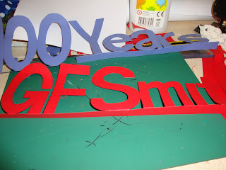


I decided to use the colours blue and red as on most of their posters GF Smith like to remind us that they are British.


These are just a few quick photos to investigate some layouts. I feel like i need more than just the words in the same typeface, Its not really showing much about paper.


This isn't exactly showing you the amazing things you can do with paper but still its something different, i'm going to see what i can do to arrange them with the other type i have cut out.


These 2 things really don't work very well together, especially like this. more experiments needed.

This is one of my earlier models for my sculpture. I found it lying around my room and thought about adding it into my layouts just to add something different to the piece. I surrounded it with some of the pieces i had from my cut outs before.

After layering the text on the top i don't think it works very well.
This does make me think about using the small sections to create something though.
Subscribe to:
Posts (Atom)